We've had a makeover: new website and brand identity
We’ve shaken things up here at the No-Trash Triangle Initiative! Working with the talented team at peers - humanize brands, we decided we needed a new brand identity and website to help us better communicate the work we do.
Timo Gerstner, co-founder of We Are Peers, visited Coral Eye back in 2018 and felt compelled to contribute in some way to the Initiative’s work. Using his experience running a brand agency in Berlin, he kindly donated his time to undertake desk research and interviews to inform NTTI’s new brand strategy.
This comprehensive work helped us define our four brand pillars – the what, how and why we do what we do.
1. Root cause – stopping plastic pollution at its source
2. Accessibility – supporting knowledge sharing
3. Base and shelter – providing space for collaboration
4. Self-efficacy – encouraging new economic and social thinking
To tell this story, we needed a new look and feel and so in stepped Lukas Liniany, Lukas Liniany, Timo’s partner and co-founder at peers - humanize brands. Capturing NTTI’s brand identity, Lukas pulled together a new logo suite and colour palette for us, as well as a suggested website structure.
Using these invaluable inputs, we have completely overhauled our site, expanding and updating it so it clearly communicates our mission, what we’ve achieved to date and how we’re bringing about change. We’ve increased the amount of information on our site about the research we’ve supported through our scholarship program, highlighting the important role science plays in everything we do. Our new press section is proof of the work we’re doing, the global coverage we’ve achieved so far reflecting the international collaboration that enables NTTI’s work.
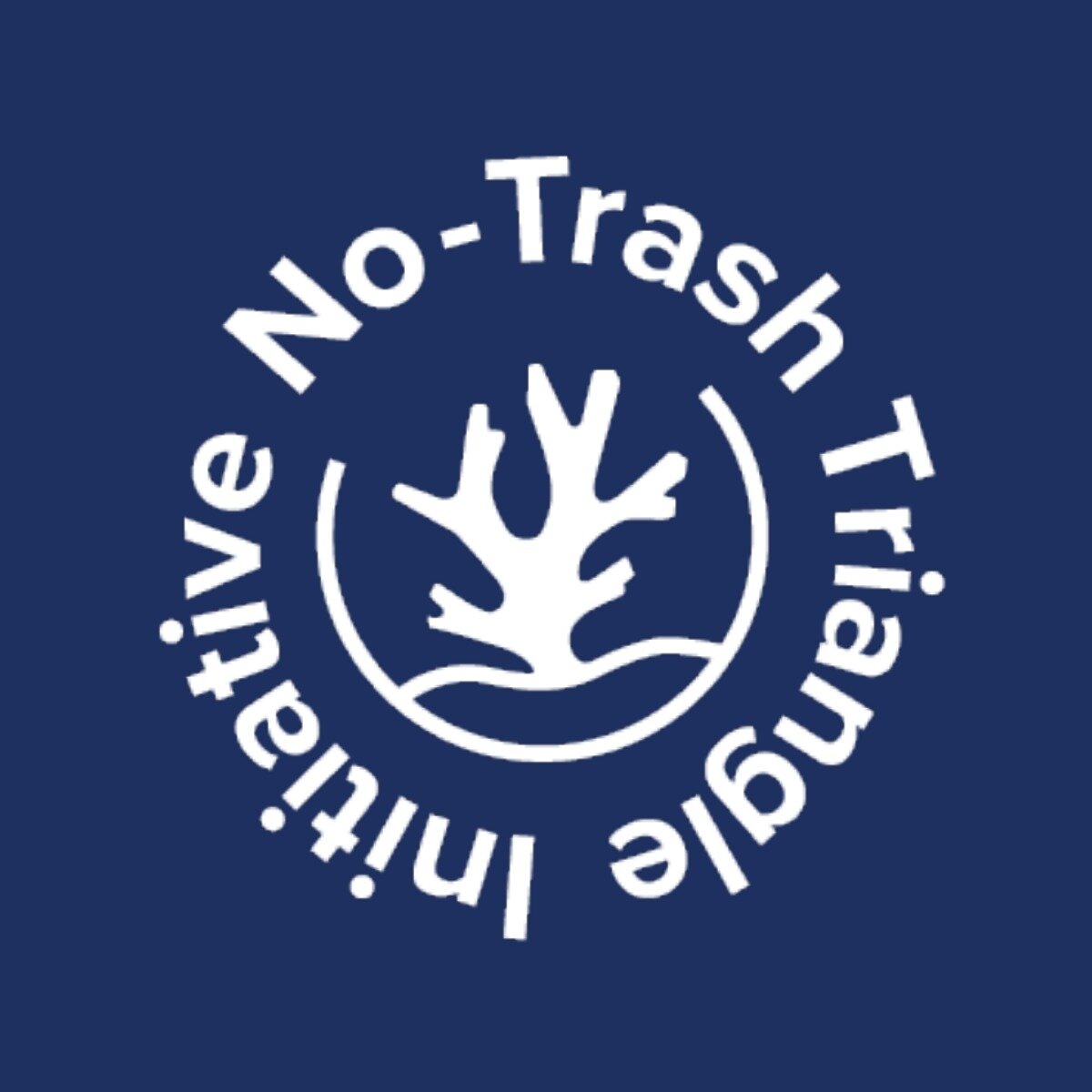
Our new logo is a wonderful representation of all that we do to protect the Coral Triangle. The frame is a tangible symbol for protection, representing harmony – the sea, nature and earth. As an open circle, the frame is also an invitation to participate, showing that it’s not too late to save our marine ecosystems. The several arms of the coral symbolise our four brand pillars and their intersectionality as well as the international NTTI network. The coral branch is rooted in a solid base, in line with our focus on developing root cause solutions to truly address the plastic pollution problem. This new logo and our new colours are unique representations of the No-Trash Triangle Initiative and ensure we stand out visually.
We would like to thank Timo and Lukas for taking the time to understand the NTTI brand and providing us with a stand out design, identity and website. We are delighted with the outcome! We have rolled out this visual identity across our social media accounts to mirror our new website. We hope that it will help us tell our story and spread the word, ultimately inspiring action and positive change. Take a look around and let us know what you think!